Delivering a seamless personalized omni-channel banking experience for retail banking customers of Africa's most valuable bank.
Overview
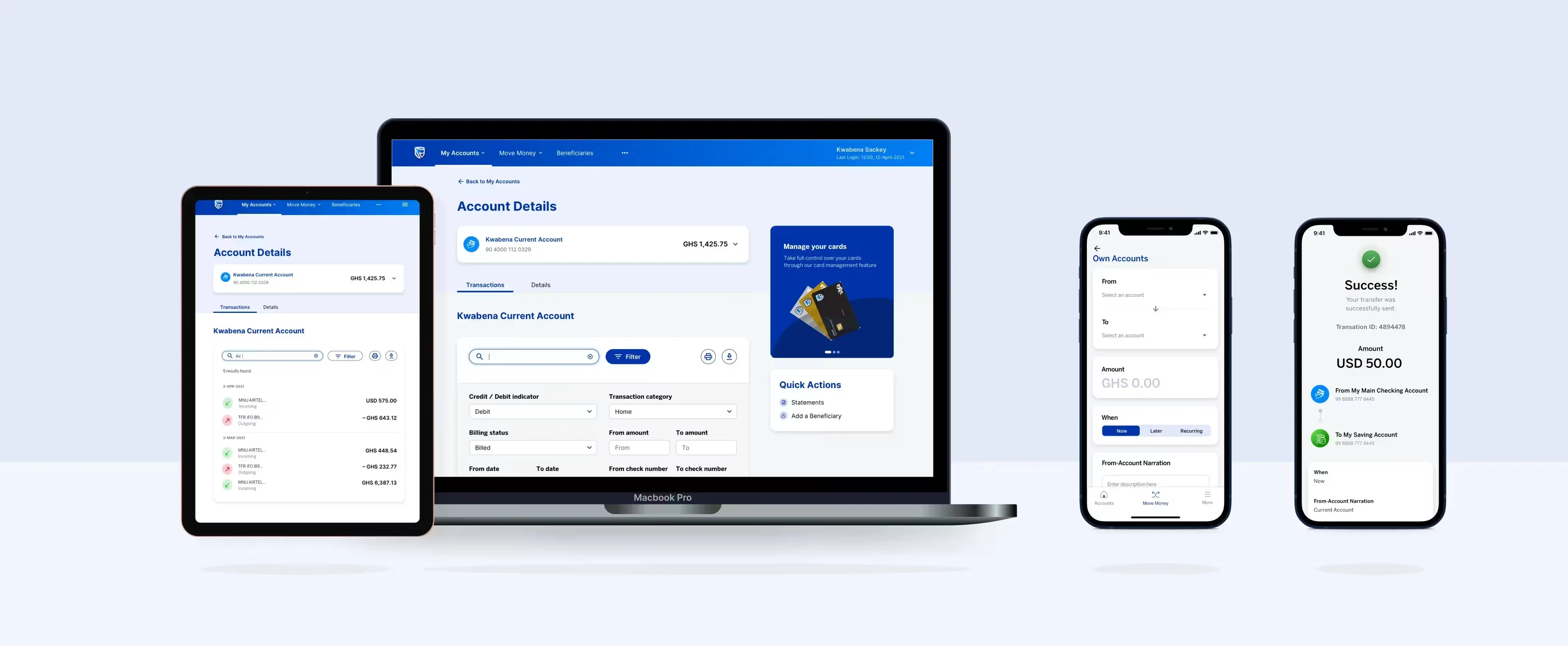
When Stanbic Bank realised its digital services were lagging behind rapidly changing customer expectations, it launched a comprehensive digital transformation. This strategy revolutionised the banking experience by integrating omnichannel capabilities and smart features. The success of this approach was so significant that the innovative platform was subsequently scaled to key markets like Mozambique and Kenya.
We collaborated with the bank to position them as leaders in digital banking innovation in Africa. This presented a unique opportunity to not only retain existing customers but also attract new segments and establish a competitive edge in a crowded market.
Platform
AndroidiOSWebMy role
Lead designer
Toolkit
Miro, Sketch, Invision, Maze
Timeline
2021
The problem
In 2021, Stanbic Bank Ghana's leadership identified a widening gap between their existing digital solutions and rapidly evolving customer expectations. The financial services landscape in Ghana was undergoing dramatic transformation, with traditional banking institutions facing unprecedented pressure from agile competitors and emerging neo-banks that were delivering superior user experiences with minimal friction.
Based on feedback from bank surveys to over 5k customers a lot of customer painpoints had gone unidentified and unaddressed and there was a need to solve for these challenges.
■ Key challenges highlighted:
User experience: Key flows were riddled with friction, leading to a 35% drop-off during onboarding and stagnating engagement at just 25% MAU.
Stability & performance: The application was unstable, failing all performance benchmarks (load, stress, spike, and soak testing).
New horizon of possibilities: The legacy system's technical debt and architectural limitations prevented the implementation of modern features stifling innovation.
Research
By analyzing support tickets and app store reviews, then validating them through customer and support staff interviews, I uncovered the key pain points users faced and the ingenious workarounds they had developed.
■ Methods
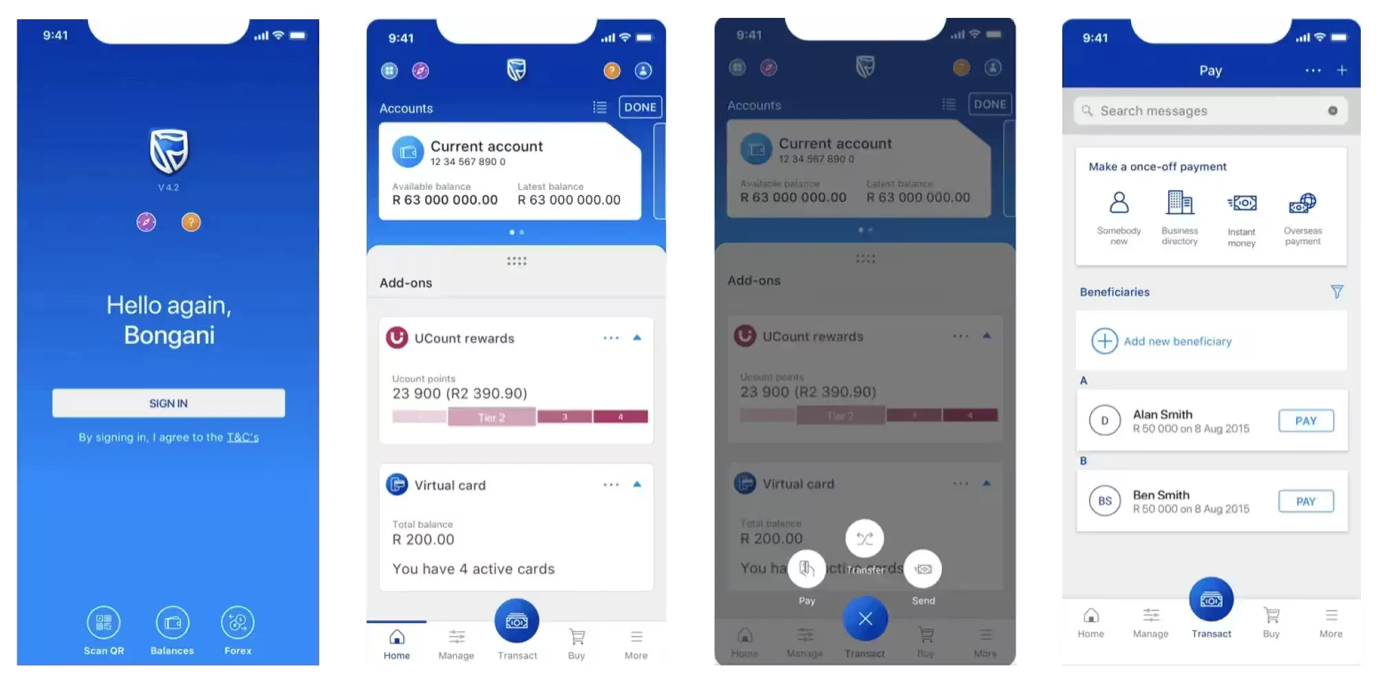
UX teardown
Interview questions
- • How often do you use the Stanbic App?
- • What are the basic features you use in the application?
- • How do you feel using these features to perform tasks?
- • What are some of the things you look out for when using the app?
- • What experiences stand out for you when using similar apps?
■ Findings
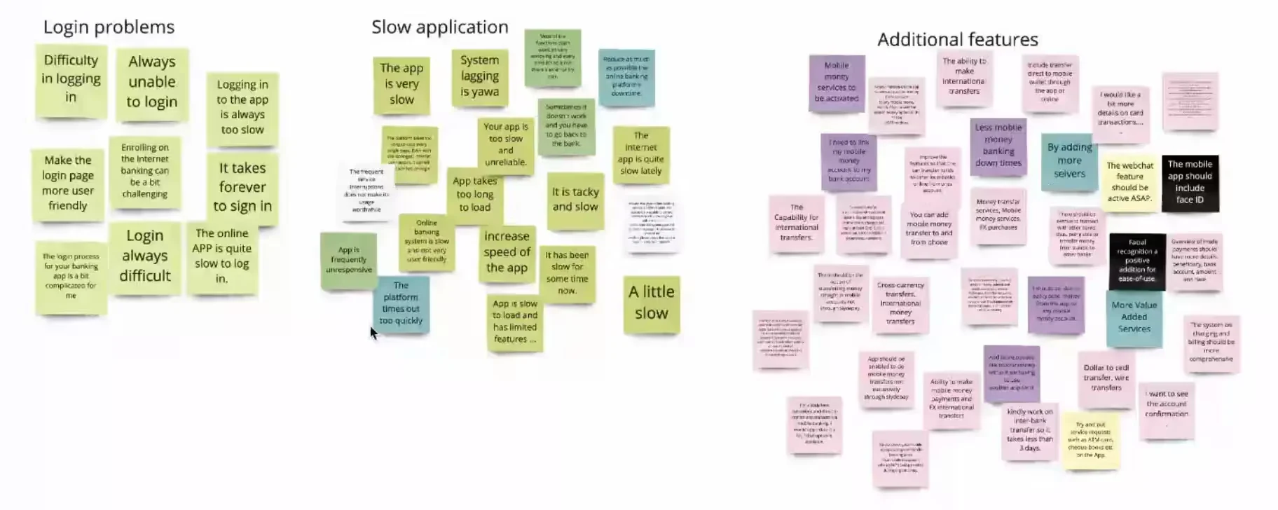
Affinity mapping to identify themes
In summary
- • Users have difficulty logging into the app.
- • Most features don’t work & returned an error to try later.
- • Users can't filter statements for specific time periods.
- • Frequent forced app updates that inconvenienced users.
- • Less tech savvy users had difficulty in accomplishing tasks.
Insights to design
Prioritization and ideation
Exploring solutions through a moodboard and low fidelity flow enabled us to visualize the order creation process and we began aligning with stakeholders. Stakeholders and team members reviewed the wireframes and gave us constructive feedback on opportunities for improvement. This helped us identify potential issues early, significantly reducing the time we could've spent on revisions later in the process.
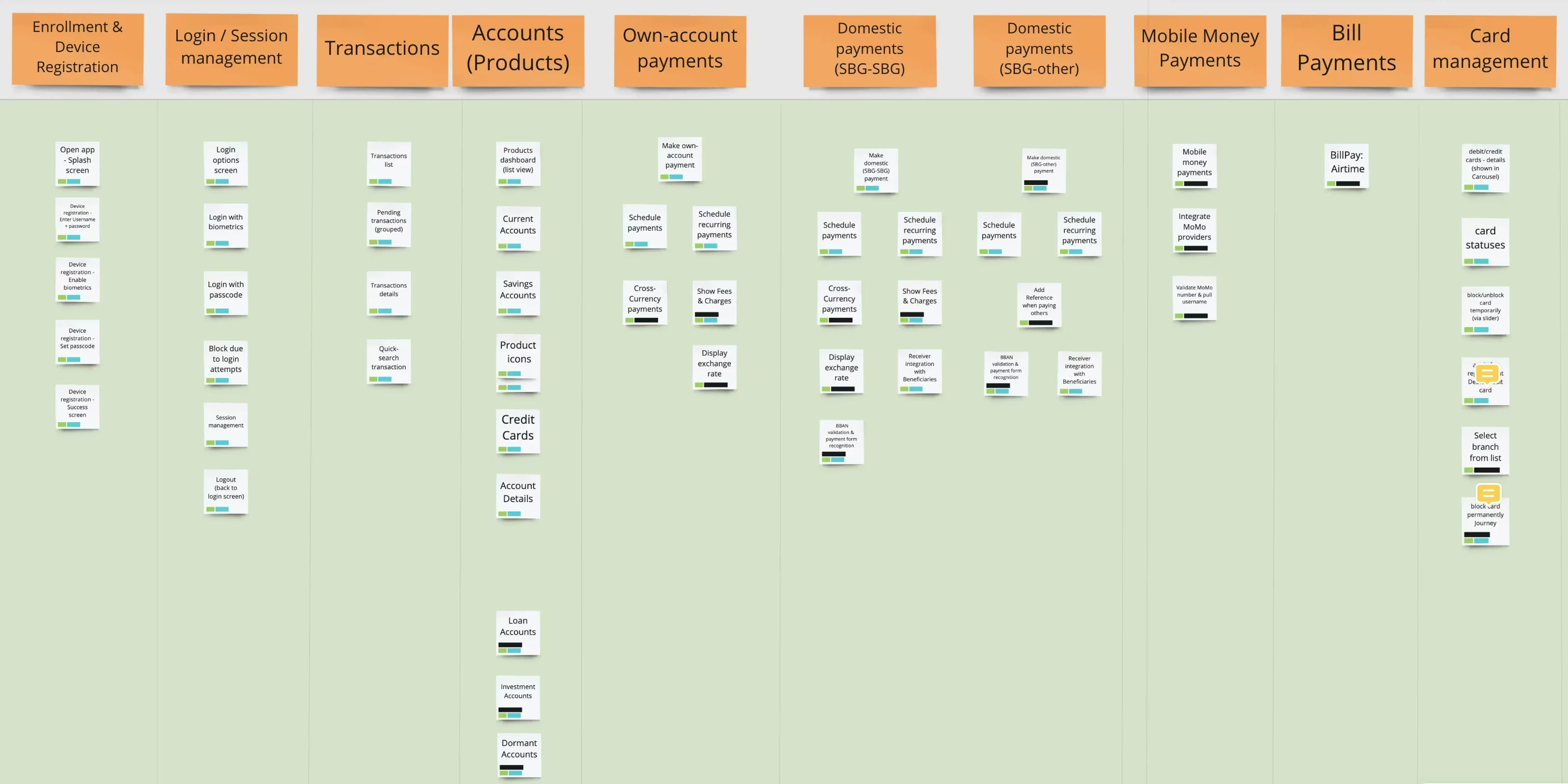
Priotization by card sorting
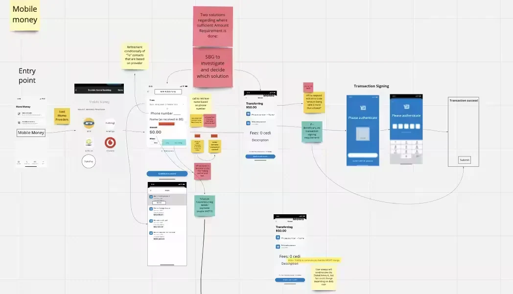
Lofi design various features
Final design
Exploring solutions through a moodboard and low fidelity flow enabled us to visualize the order creation process and we began aligning with stakeholders. Stakeholders and team members reviewed the wireframes and gave us constructive feedback on opportunities for improvement. This helped us identify potential issues early, significantly reducing the time we could've spent on revisions later in the process.
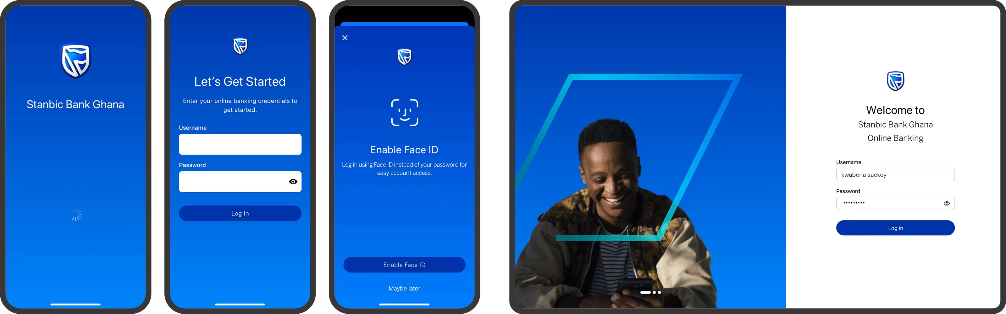
Authentication & device registration
This seamless onboarding journey allows you to connect with your various accounts in a way thats simple but secure creating a connection between your device, the app and your various accounts.
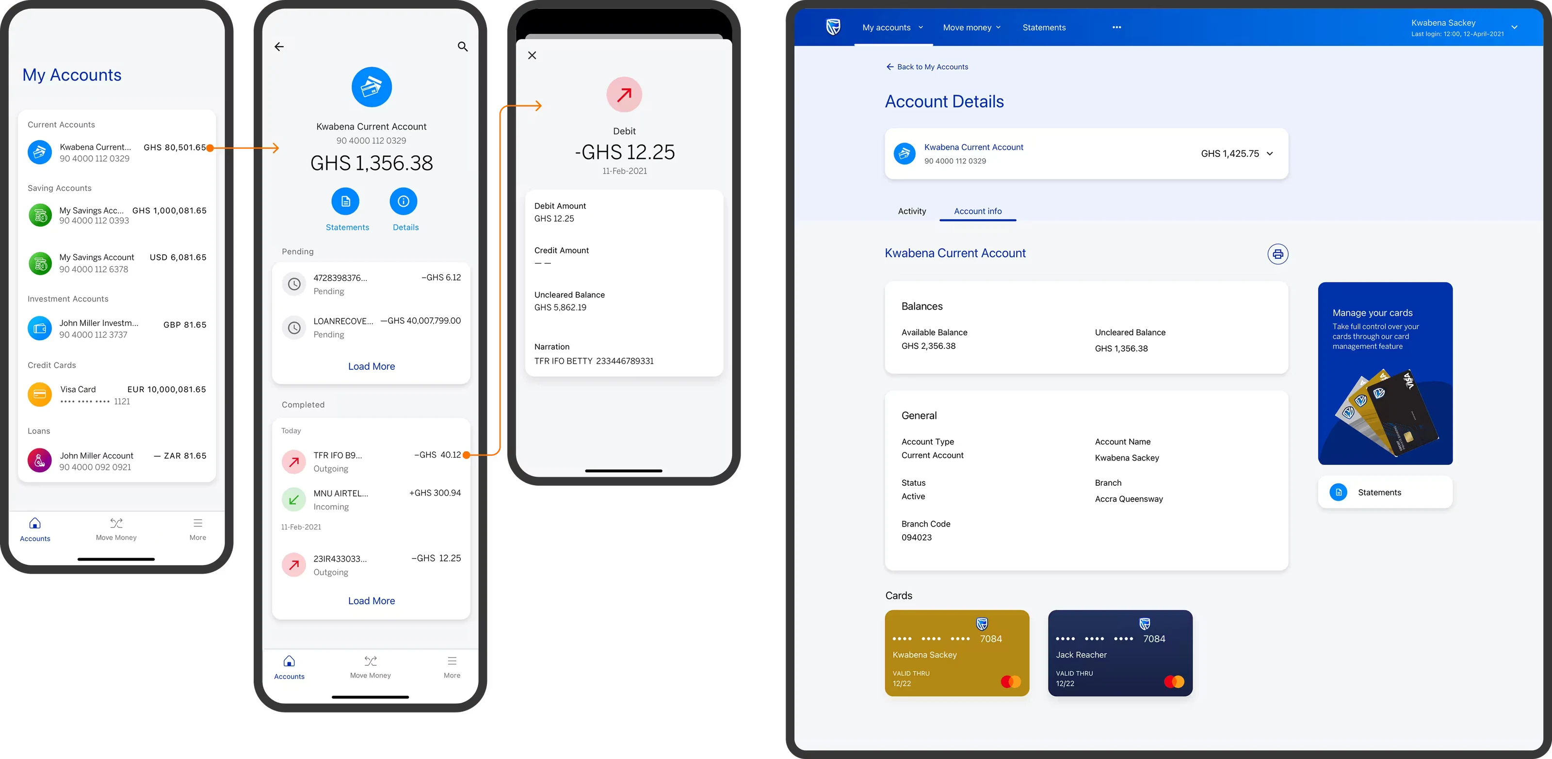
Accounts and transactions
Dive into any accounts to see a history of your transactions, with the power to search, filter, and sort and export your transactions.
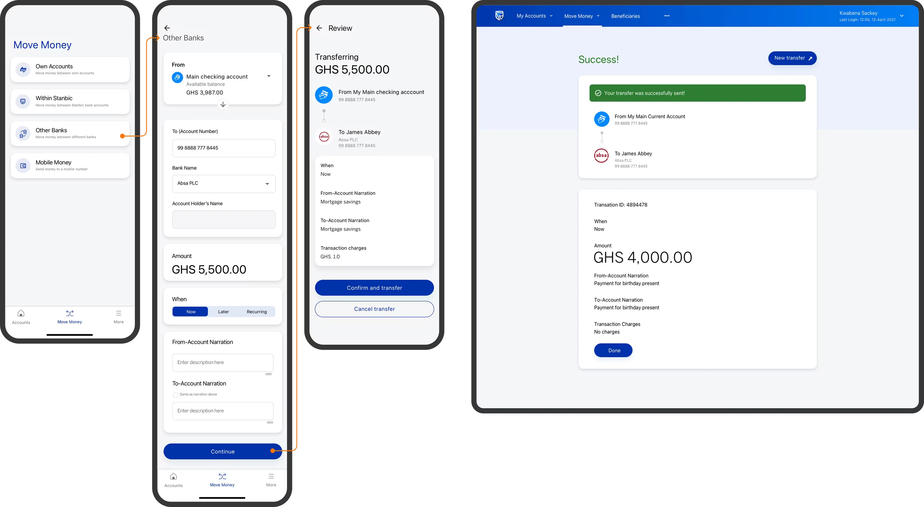
Transfers & payments
Move money anywhere, in the same or different currencies, to yourself or others. Users can schedule a single payment for the perfect moment or set up recurring transactions to automate their financial commitments, all with the same effortless confidence.
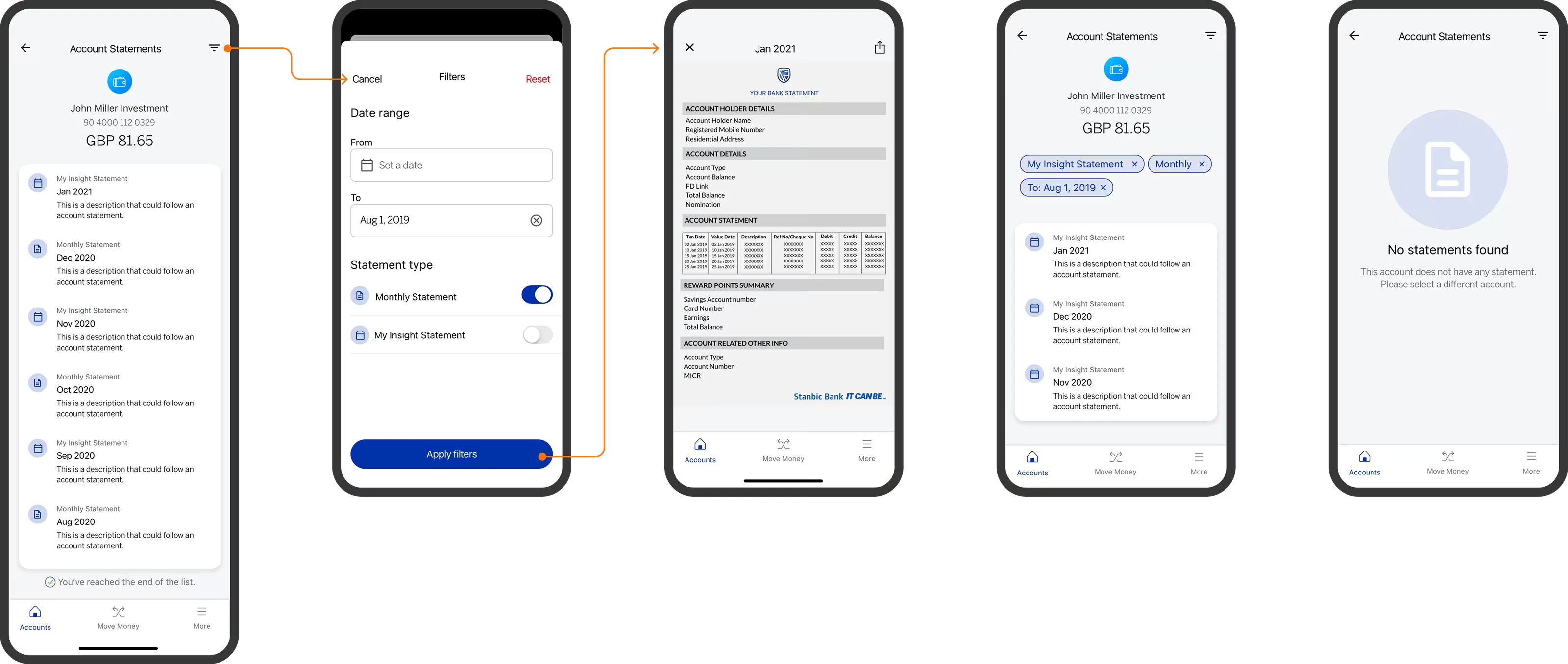
Generating account statements
Now you can define any date range you need and instantly generate a clean, exportable PDF.
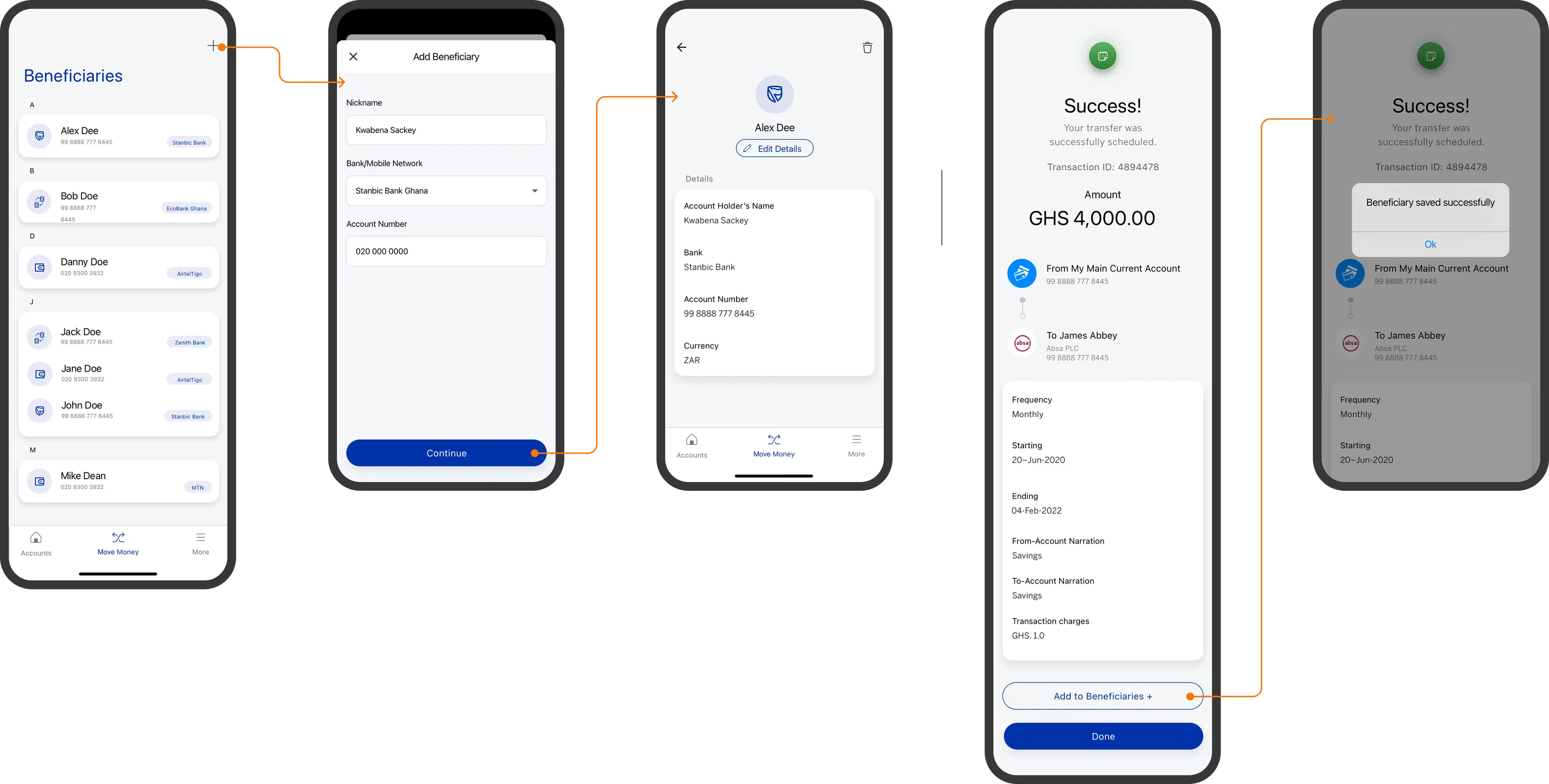
Save time with benefitiaries feature
After any successful transfer, the app gently asks if you’d like to save those details for next time. Users don't have to re-enter details for people they pay regularly.
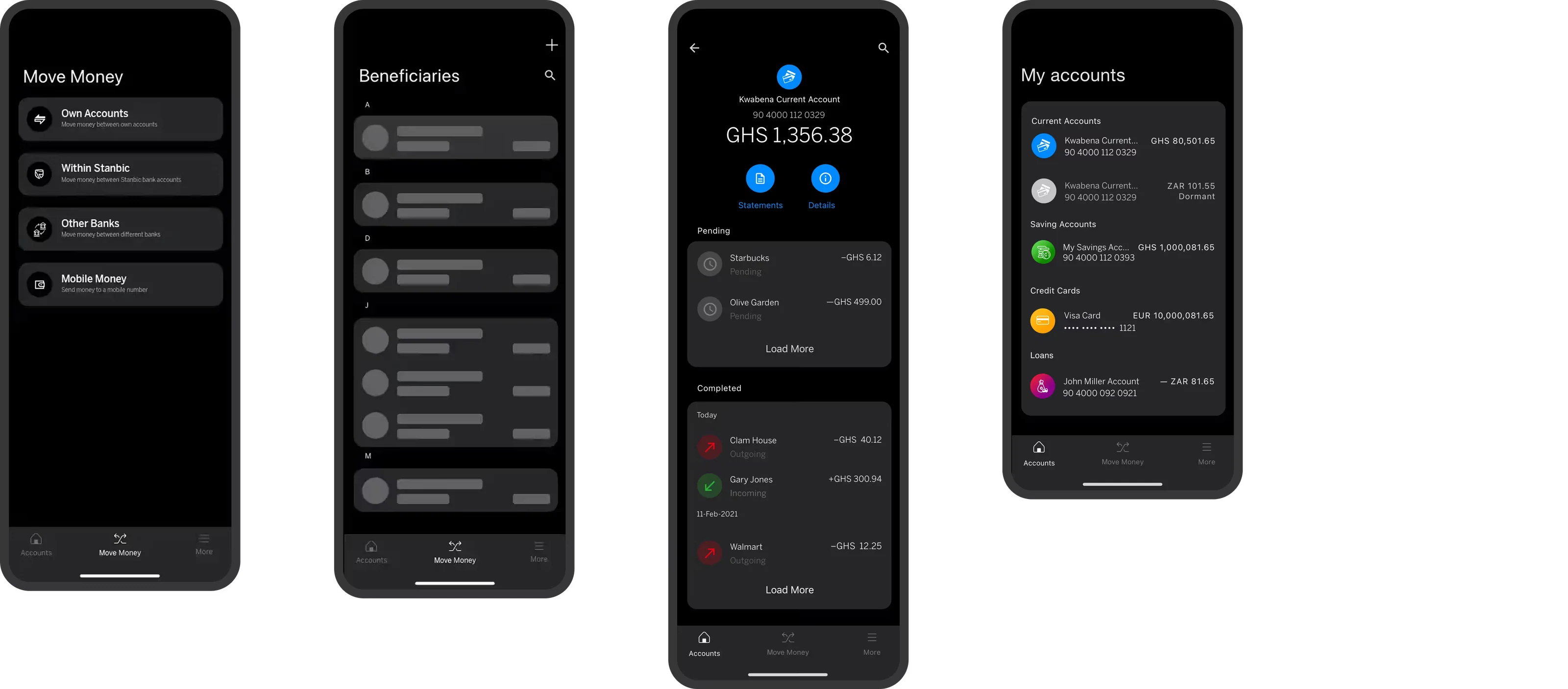
WCAG dark mode
Designed for late-night check-ins or just a more comfortable viewing experience, our dark mode isn't just an aesthetic choice. It's a thoughtful implementation that adheres to WCAG 2 guidelines, reducing eye strain and ensuring the app feels as good as it looks, no matter the time of day.
After the redesign...
Usability testing
We conducted the tests in a controlled environment where participants were given scenarios and tasks based on common use cases. This helped us catch problems early, validate design decisions, and assess the overall user satisfaction.
My role included : Test scoping → Testers recruitment → Conducting tests → Evaluated the findings → Presenting the findings → Iteration
participants including customers and bank staff.
successful task completion of the journeys we explored.
agreed the new experience met most of their expectations
Measuring success
We rolled out the MVP to bank staff and their families who are SBG customers as well as about 1000 customers to pilot and test. We will use insights from the pilot to iterate and develop an ever better product.
Adoption
Onboarded users vs users who use the new app and how regulary.
Support calls
We tracked the number of calls from customers regarding issues with the app.
User feedback
based on survey feedback after the first and second week
In retrospect
I learnt how to communicate the value of the design. As many of my teammates didn't have any prior experience working with a designer before, I had to advocate for the importance of design and user's needs.
Always remember to test with users at every step of the design process to get valuable feedback and avoid costly mistakes. I am a strong believer that using hypothesis, experimentation and fast idea generation are important principles in creating great solutions.